PROJECT
Fern & Soul - Brand Identity Design
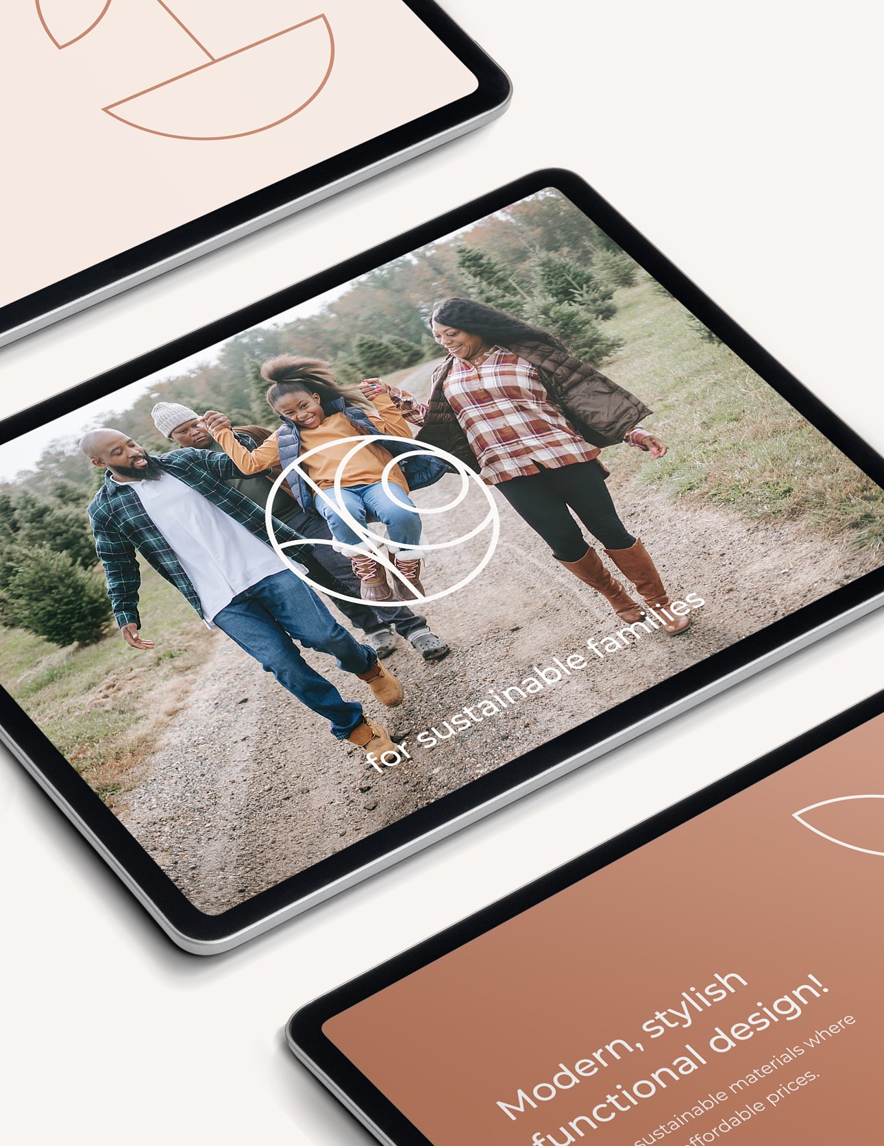
Fern & Soul will be offering sustainable products for the outdoors from short day trips to travel, which are durable and functional for families yet exude a stylish aesthetic.
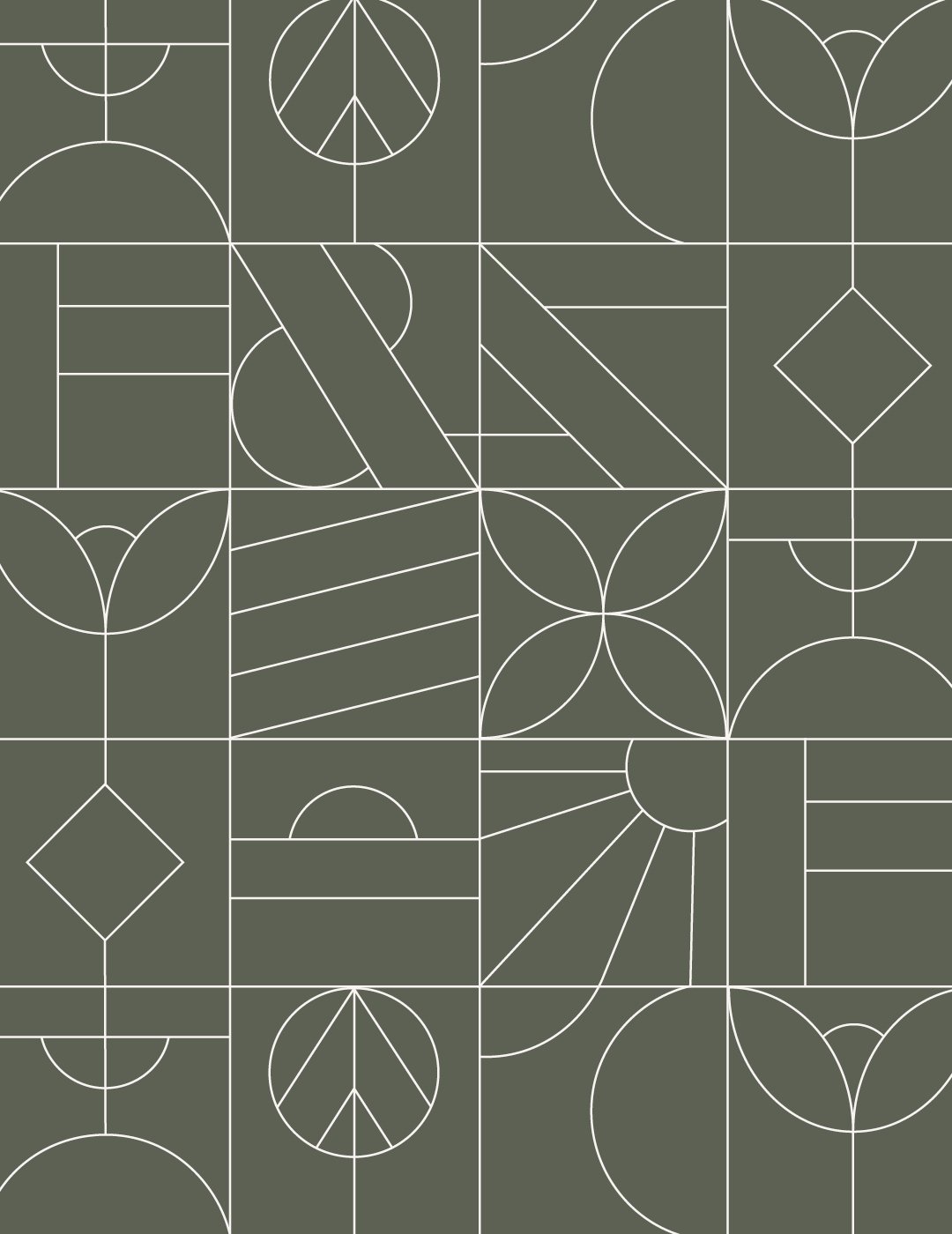
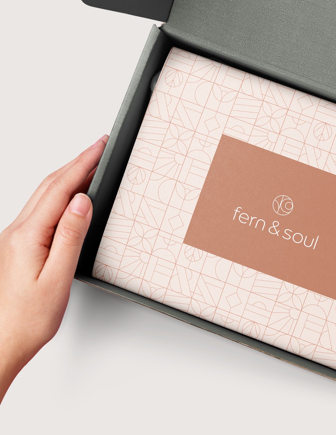
The aim was to conceptualise the ethos of the brand, which are sustainability, style referenced to nature and travel on which the business was founded. The sophisticated design was underpinned by a colour palette that draws inspiration from the forest and natural environment. Simple, clean stylised illustrations and pattern design were created to represent what the target audience loves to do (outdoor adventures and travelling), which evokes feelings of joy and beautiful memories that fuel the soul.
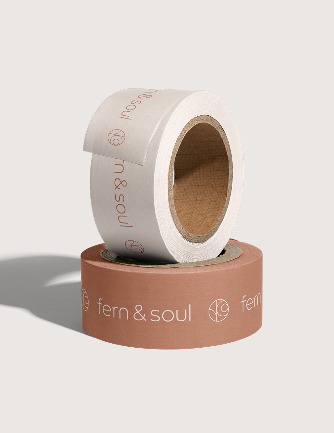
The brand icon mark is of abstract shapes and elements (tree, sun and lake, water) - embodying nature and an outdoor lifestyle, which align with the ideal customer. Curved round shapes that are soft and more feminine were featured to appeal to the female target audience. The customised wordmark logo achieves a clean and friendly aesthetic, incorporated with shapes that lend themselves to the great outdoors and adventures.
‘Overall I'm super happy and very excited to now have a great brand feel and brief. It really opens up the mindset of
where the brand can now go.
Really makes me feel like its a brand now. This has a been a great experience so thank you so much for everything!’
Fern & Soul


